
Understands preferences
Builds context from conversations, preferences, and shortlists to understand what the trekker is looking for.
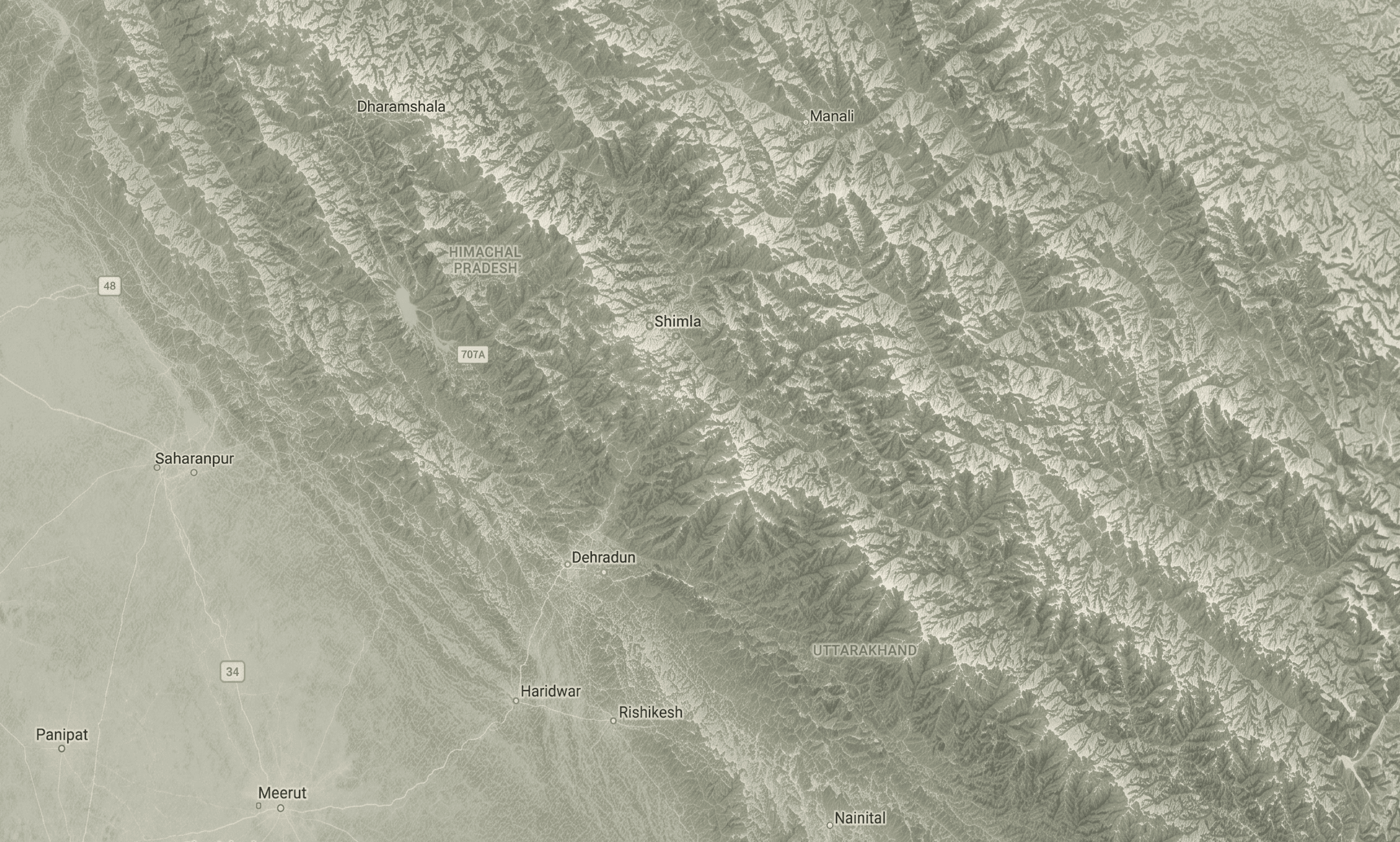

Someofthebestjourneysdon'tshowupinGoogle maps
Choosing a trek is a real decision, one that deserves careful thought, but all we're left with are unanswered questions.
Paidal
The most beautiful journeys
can only be experienced on foot
More than providing information, Paidal helps with the decision-making.
It helps pick safe first trek for beginners, and the right next one for experienced trekkers.
Choosing a trek involves more than finding one that looks interesting. The right choice depends on how the trek matches personal preferences, experience, fitness, season, and expectations.
It answers questions like:
Builds context from conversations, preferences, and shortlists to understand what the trekker is looking for.
Suggests treks based on that context, turning recommendations into interactive trek cards.
Cards connect AI responses directly to Paidal’s trek data, allowing deeper exploration of routes, maps, difficulty, terrain, and other details.
Why I chose a spatial discovery layer over a simple card list
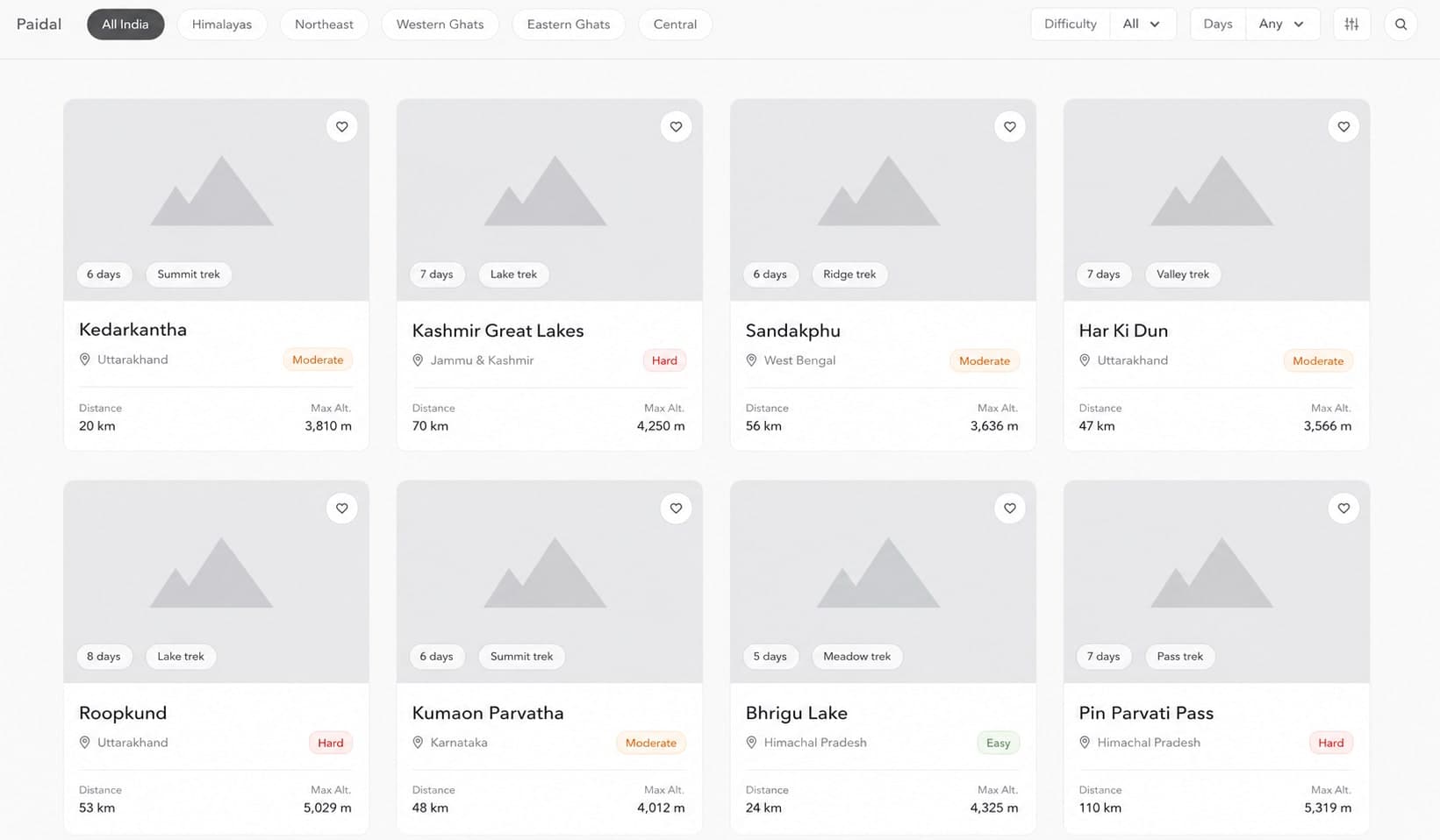
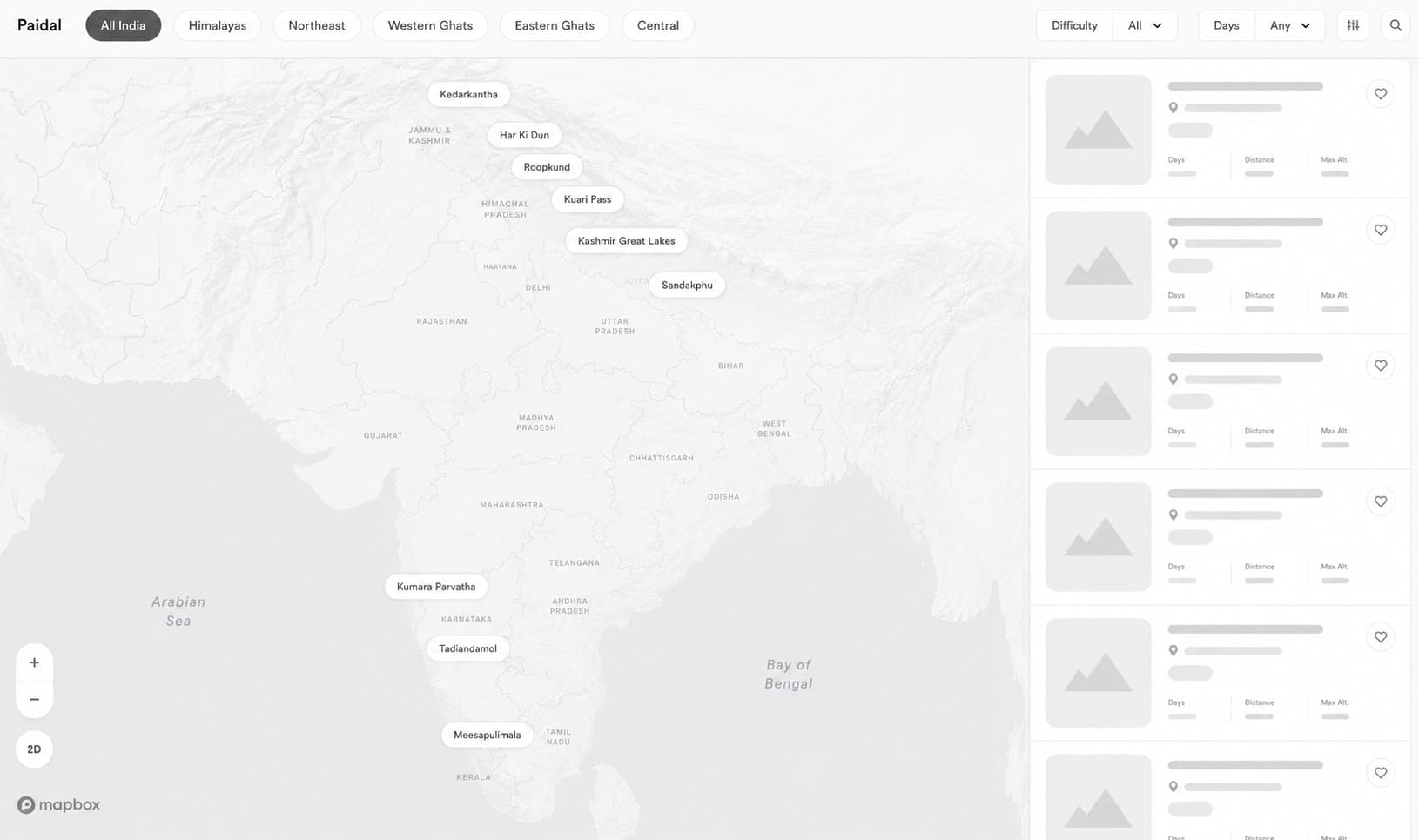
While selecting a trek, factors such as route, terrain, elevation, and location play a critical role in decision-making, yet traditional platforms often bury this information to the second layer.
Paidal addresses this by prioritizing a map-based interface, aligning with how users naturally evaluate trekking options.
Designing filters for the decision layer
A real challenge was figuring out what actually influences their decision the most, what only refines it, and what barely matters at all. Research and real feedback shaped that hierarchy.
Primary filters
Secondary filters
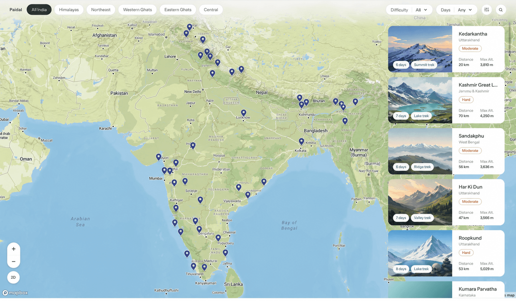
Choosing trek names over markers as location identifiers
Markers
What Works
Clean, minimal, and scales well at high density.
Challenge
Requires an extra tap just to know what you're looking at. A trek isn't pinned to a point, it's a route.
Named pills
Went with this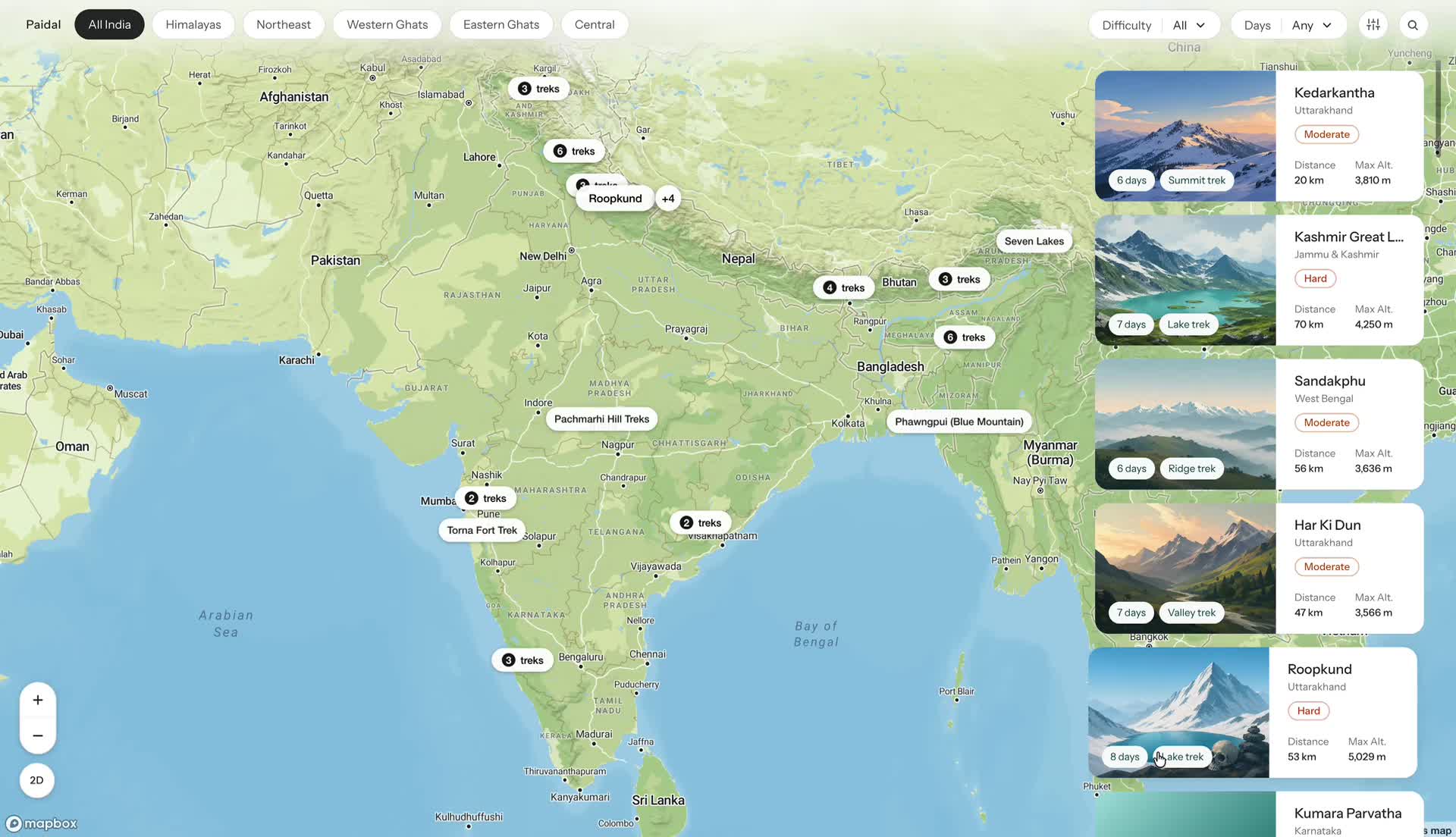
What Works
Instantly recognizable. The map doubles as a list.
Challenge
Overlap when treks sit close together, needing a clustering mechanism at different zoom levels.
Designing how the map, the list, and the pills respond to each other
Making it cheap to check out a trek before committing to one
Every jump to a full page costs more than the click itself. Leaving the map, even briefly, feels like stepping out of exploring and into one specific trek.
Keeping the preview in place removes that cost. Since checking a trek out doesn't require leaving the map, there's no penalty for looking at five before deciding, so comparison becomes the default instead of something a user has to push through friction to do.
One trek, even when there's more than one way up
Treks with more than one route stay a single trek, switched right on the map instead of being split into near-duplicate listings.
Dynamic grouping of checkpoints at every zoom level
Checkpoints that overlap on screen group together, but only a single checkpoint gets a line pointing to its exact spot, since a cluster's position is only ever an average, never a real place.
The same trail looks like a different place depending on the month
A trek's photos are frozen at one month. Ground cover is mapped along the full route and animated across the year instead, so a planned month shows up as it will actually look, not as a guess.
Trail flyover
I turned the static trail line into a playable flyover, letting users follow the route as a continuous journey through the landscape.
On desktop, hovering over a trek card highlights its corresponding map chip, making it easy to connect the card to its location. On mobile, that relationship had to work through touch while keeping map exploration fluid.
Since hover is unavailable on touch, card scrolling highlights the corresponding trek on the map, preserving the connection between the two surfaces.
The desktop side panel becomes a bottom sheet with three interaction states: contracted, expanded, and an intermediate state for browsing.
The sheet expands on swipe and intelligently contracts when the map is played or the user starts interacting with it, keeping the map unobstructed during exploration.
One consistent scale for a trek's difficulty level
The problem
Difficulty is subjective. One trekker's easy is another's hard, so a word like moderate ends up meaning something different depending on who wrote it.
The fix
Every trek is scored the same way, on the same weighted factors, so the number holds up no matter which trek you're comparing it to.
What the score weighs
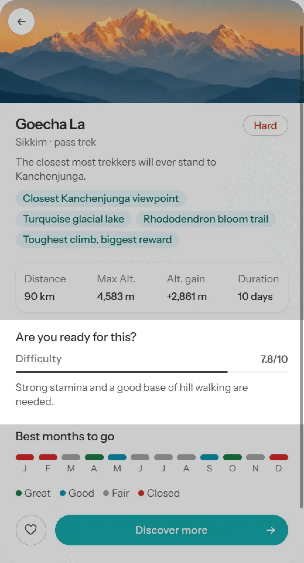
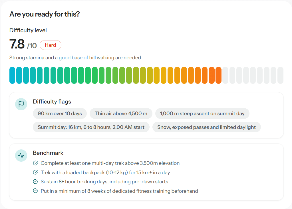

"Are you ready for this"
Difficulty is relative. What's moderate for one trekker is genuinely hard for another, so no single word can answer that for everyone.
That's why it was never framed as a difficulty level. It's a question, answered with exactly what being ready actually takes.

We assumed conversation with AI should work like messaging apps
Today's AI assistants borrow the chat thread model from human messaging.
It feels familiar, but AI conversations are fundamentally different.
Chat with human has a defined boundary
For human to human interaction, the boundary is obvious.
One person. One conversation.
But with AI, there is no natural conversation boundary
With AI, there is only one assistant. Every new thought could belong to the same chat… or a different one.
When conversations have no natural boundary, two problems emerge.
The boundary detection problem
Every topic shift forces the user to decide whether to continue or start over.
The buried knowledge problem
As chats pile up, valuable ideas disappear into conversation history instead of becoming reusable knowledge.

Grove
AI assistant that not just provides information, but helps it turn into usable knowledge
See it liveTwo spaces, built for different mental models
Exploration space
Most conversations begin without a destination. People explore ideas, ask questions, and naturally drift between topics. Grove lets them do exactly that in the Exploration Space.
It removes the burden of chat switching by quietly detecting topic shifts and organizing related discussions into themes in the background.
Conversations appear as a continuous stream, with theme-based navigation in the timeline.
Knowledge space
As a theme gains enough context, it can be promoted to a Knowledge Space. Grove preserves the accumulated conversation and turns it into a dedicated workspace for deeper, focused work.
Knowledge space gets all the features of a theme — additionally, it gets a separate context assembly mechanism and a knowledge graph view.
How Grove solves the knowledge burial problem
Themes contain reflections which instantly give an overview of what was discussed in the topic.
When a user finds something useful worth saving for later, they can quickly mark it as a note.
The notes become the building block for insights, which are created at the topic level.
Why user agency was prioritized in knowledge capture
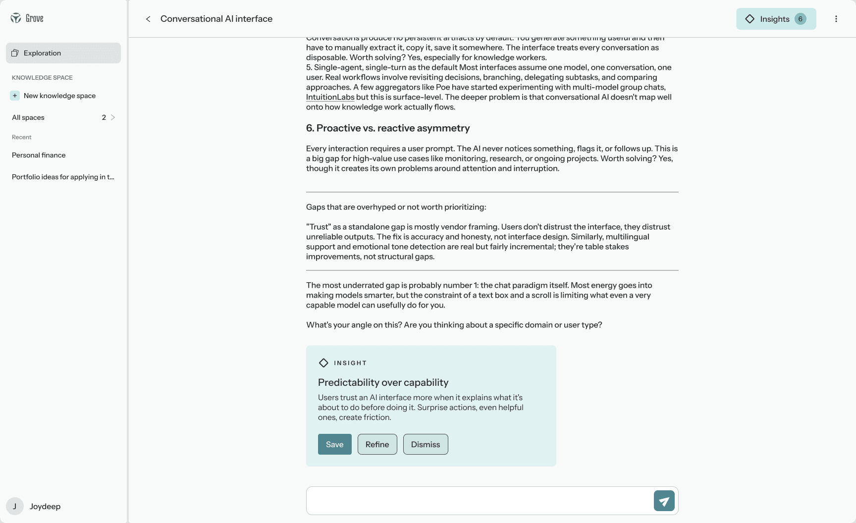
Early prototypes relied on AI to surface insights automatically. Testing showed that relevance is deeply personal. The system frequently highlighted information users didn't consider worth keeping.
Grove now treats AI as an assistant that organizes information, while users decide what deserves to become knowledge.
The most difficult challenge was organizing a stream of untagged conversation into relevant themes.
The idea was simple, but getting it to actually work accurately took several iterations. Here's the version that finally stuck.
The core logic (TL;DR)
The full decision flow
Another challenge was to assemble context from a continuous stream of conversation
Instead of passing the entire conversation history, Grove identifies the relevant topic and assembles context from it. This keeps responses focused while allowing conversations to flow naturally.
The components that build up the context for each LLM call
A fixed set of instructions which gives a certain personality to Grove's response.
Stored facts about the user.
Identity, goals, preferences, problems, and recurring patterns.
Chunks pulled from earlier conversations, matched to the current question.
The question is compared against the user's existing themes using a similarity score. The score decides how the search runs:
| Match | What happens |
|---|---|
| Strong match to one theme | Nudged toward that theme's wording. One quick search. |
| Weak match across a few themes | Separate searches per theme, kept apart so they don't dilute each other, plus one plain search. |
| No clear match | One broad search, using relationship-tracing between chunks. |
A running list of decisions and settled points from earlier in the conversation.
The part that's fallen out of the last 20 messages but hasn't been picked up by the theming pipeline yet.
Results from the web search, if needed.
The last 20 messages, which give the LLM context about what's being spoken about.
For a demand planner, the most scarce resource is their attention.
A Demand Planner manages forecasts across a portfolio of 1,500+ SKUs. With limited time to review each one, the challenge is knowing which products need closer attention and which can be left alone. A system was needed to prioritize the portfolio before the planner starts reviewing it.
Before a planner acts, the system needs to answer
Two problems the system had to solve
Knowing what needs attention
The planner needs to distinguish meaningful deviations from normal variation and decide where investigation is worthwhile.
Acting on what needs attention
Once something needs attention, the planner needs to take the necessary action to address the issue.
Designing the attention model
Every SKU is evaluated against three separate hierarchies. Each answers a different question and determines a different kind of planner attention — none of them wait on the others.
Forecast Governance
Does the forecast need my judgment?
Exception
Is something wrong right now?
Personal Curation
What do I want to watch?
Forecast Governance
Does the forecast need my judgment?
Exception
Is something wrong right now?
Personal Curation
What do I want to watch?
Forecast Governance
Forecast Governance weighs each SKU's importance, predictability, and trajectory, then uses that judgment to decide how much human effort it actually deserves.
Does this SKU carry enough revenue to matter?
ABC classification based on revenue — it sets the stakes before any forecasting effort is spent.
A-class
Highest revenue impact — 80% of revenue.
B-class
Moderate impact — 15% of revenue.
C-class
Lowest impact — 5% of revenue.
How predictable is this demand?
Demand history is classified using ADI (average demand interval — how often a SKU sells) and CV² (coefficient of variation — how much that demand swings).
Smooth
Steady and easy to forecast automatically.
Erratic
Frequent, but volatile — needs wider trust bands.
Intermittent
Sparse, but regular gaps — still forecastable.
Lumpy
Sparse and volatile — the hardest pattern to trust.
Is the pattern changing?
A change in predictability is itself a signal — worth flagging before the forecast even looks unreliable.
Stable
Same pattern as before.
Degrading
Moving toward harder to predict.
Stabilizing
Moving toward easier to predict.
How much human effort does this SKU deserve?
Importance and predictability combine into a single routing decision — where a SKU lands determines how much attention it gets.
Touchless Core
Stable, predictable demand. Runs automatically.
Consensus Pool
High-value, hard to predict. Sales & trade marketing weigh in.
Inventory Policy Group
Low-value, long tail. A simple inventory policy instead of a forecast.
Exception Queue
The pattern changed. Planner reviews the forecast.
Exceptions
Exceptions highlight SKUs where a defined planning condition has crossed its threshold and needs planner attention. Each exception is classified by its type and priority, so planners can quickly understand what needs attention and how urgently.
Exception types
These are the signals that trigger an exception when their defined threshold is crossed.
Exception priorities
Critical
Requires immediate attention.
High
Requires timely review.
Medium
Worth monitoring.
Personal Curation
The system cannot catch every SKU that needs attention. Planners often know more about the business than any signal can capture. Personal Curation lets them build their own watchlist by hand, kept separate from what the system flags on its own.
Why the watchlist stays user-controlled
An earlier version auto-populated the watchlist from system signals. This created false positives — a SKU could be flagged as excess stock even when its DOI was within a healthy range.
Exceptions = system judgment
A documented threshold has been crossed.
Watchlist = planner judgment
The planner decides what deserves continued attention.
The next challenge was to enable quick action on the exceptions
See the signal
The adjustment panel opens with the signals that triggered the exception — the planner immediately sees what changed and why the SKU was flagged.
Act on the signal
The panel opens on the action tied to the problem. When both signals are present, both actions stay available in the same context.Supply signal → Add OrderForecast signal → Adjust Forecast
Capture the decision
Forecast changes are made directly on the chart, and a reason is required before the change can be applied — the decision and its reasoning stay together.
What changed for planners
Before
Scan everything, find a problem, navigate elsewhere, fix it, document it.
After
Open the queue, investigate the exception, act in context, reasoning captured.
The most important shift in this project was moving from showing information to managing attention.
Resense became less about showing planners everything and more about helping them focus on what actually needs their expertise.